Affise
Affise is a performance marketing analytics and attribution platform used by analysts, ops, and growth teams to monitor campaign performance, conversions, and traffic quality. The product includes high-complexity dashboards, dense data tables, and multi-step workflows requiring frequent decision-making under uncertainty.
Because of the product’s scope and technical nature, clarity and cognitive load reduction were consistent user pain points.

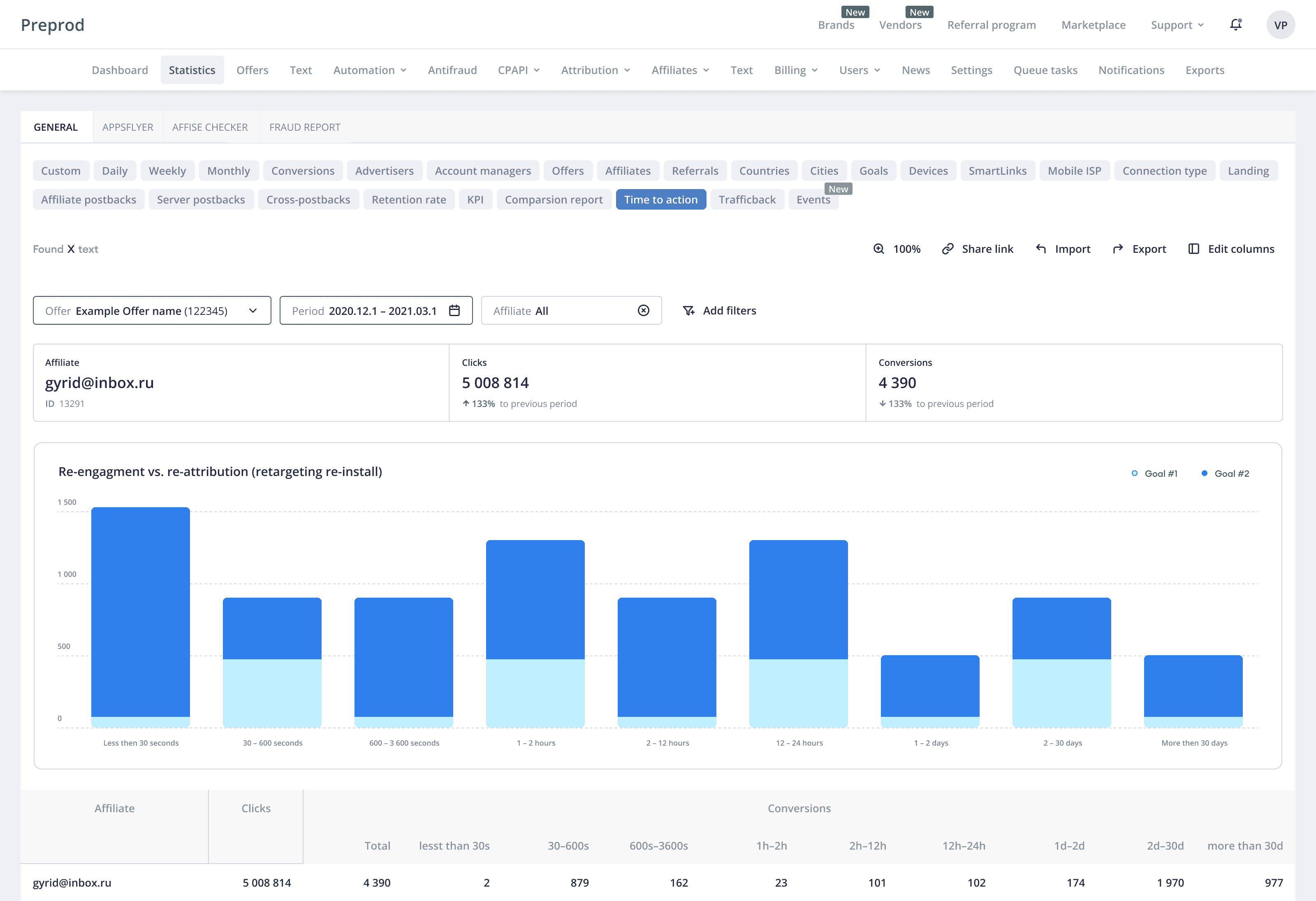
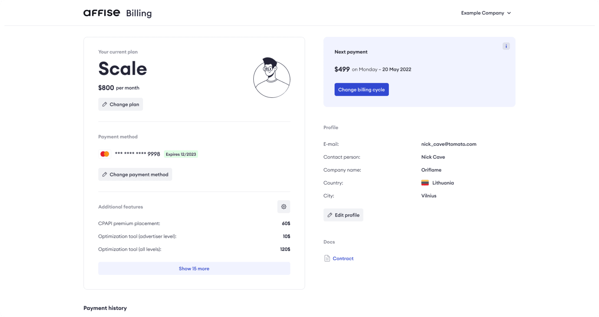
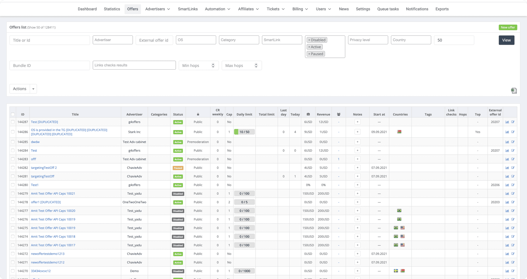
Core Product Screens
Selected screens of the Affise core platform, including performance dashboards, traffic analytics, conversion tracking, and operational workflows used by analysts and account managers on a daily basis.
Domain
Performance
Marketing
Type
B2B,
SaaS
Role
Senior Product
Designer
Scope
Dashboard redesign,
workflow clarity,
internal reporting & tools
Team
PM, engineers,
analysts, QA, CS,
CEO, CTO
Core Product Screens
Selected screens of the Affise core platform, including performance dashboards, traffic analytics, conversion tracking, and operational workflows used by analysts and account managers on a daily basis.
Selected screens of the Affise core platform, including performance dashboards, traffic analytics, conversion tracking, and operational workflows used by analysts and account managers on a daily basis.
Domain
Performance
Marketing
Type
B2B, SaaS
B2B,
SaaS
Role
Senior Product Designer
Scope
Dashboard redesign, workflow clarity, internal reporting & tools
Team
PM, engineers,
analysts, QA, CS, CEO, CTO


Case Study.
Improving statistics workflow.
Affise is a B2B performance marketing platform used by affiliate managers, analysts, and marketing teams to track traffic, conversions, revenue, and payouts.
The Statistics section is a core part of the product and the primary decision-making tool for most users.
Over time, the section became overloaded with data, filters, and configuration options, which negatively affected usability, speed, and trust in the interface.
Problem Statement
Users relied on the Statistics daily, but:
Key metrics were hard to scan and compare
Filters and presets were complex and inconsistent
Users frequently switched back to the old interface
Support team received recurring tickets related to reports, filters, and invoices
This created friction in everyday workflows and reduced confidence in the new design.

Goals
Improve clarity and readability of core metrics
Reduce time-to-insight for analytical tasks
Increase adoption of the new Statistics interface
Reduce support load related to reporting and documents
Improve clarity and readability of core metrics
Reduce time-to-insight for analytical tasks
Increase adoption of the new Statistics interface
Reduce support load related to reporting and documents
Solution
Statistics Interface Redesign
Reworked information hierarchy to prioritize key metrics
Simplified table layouts and chart structures
Unified visual language across statistics, reports, and dashboards
Filter & Preset Improvements
Improved discoverability of frequently used filters
Simplified filter logic and grouping
Introduced clearer presets for common reporting scenarios
Document & Invoice Filtering
Reduced number of steps to find specific documents
Improved consistency between statistics data and financial reports
Redesigned document and invoice filtering flows
Case Study.
Improving statistics workflow.
Affise is a B2B performance marketing platform used by affiliate managers, analysts, and marketing teams to track traffic, conversions, revenue, and payouts.
The Statistics section is a core part of the product and the primary decision-making tool for most users.
Over time, the section became overloaded with data, filters, and configuration options, which negatively affected usability, speed, and trust in the interface.
Problem Statement
Users relied on the Statistics daily, but:
Key metrics were hard to scan and compare
Filters and presets were complex and inconsistent
Users frequently switched back to the old interface
Support team received recurring tickets related to reports, filters, and invoices
This created friction in everyday workflows and reduced confidence in the new design.
Users relied on the Statistics daily, but:
Key metrics were hard to scan and compare
Filters and presets were complex and inconsistent
Users frequently switched back to the old interface
Support team received recurring tickets related to reports, filters, and invoices
This created friction in everyday workflows and reduced confidence in the new design.
Goals
Improve clarity and readability of core metrics
Reduce time-to-insight for analytical tasks
Increase adoption of the new Statistics interface
Reduce support load related to reporting and documents

Results & Metrics
Reduced “Back to Old Design” Usage
~60% decrease in clicks on “Back to old design” after release
This metric was used as a direct indicator of adoption and user confidence in the new interface
Improved Reporting Efficiency
Average time to build and export reports reduced by ~35%
Users completed common reporting tasks with fewer filter adjustments
Fewer Support Tickets
~30% reduction in support tickets related to:
statistics configuration
report discrepancies
document and invoice filtering
Document & Invoice Usability
Faster document discovery and fewer errors when working with invoices
Improved alignment between analytics data and financial reports, reducing clarification requests from users
+28%
Feature Adoption Rate
-30%
Support Ticket Rate
-45%
Time-to-Value
-60%
Legacy UI Usage
+22%
Task Success Rate
-35%
Report Creation Time
-60%
Legacy UI Usage
+22%
Task Success Rate
-35%
Report Creation Time

Key Learnings
In data-heavy products, clarity beats flexibility
Adoption metrics (like “Back to old design”) are powerful UX success indicators
Reporting UX directly impacts trust in the productImproving filters and documents reduces not only UX friction, but also operational costs
In data-heavy products, clarity beats flexibility
Adoption metrics (like “Back to old design”) are powerful UX success indicators
Reporting UX directly impacts trust in the productImproving filters and documents reduces not only UX friction, but also operational costs
In data-heavy products, clarity beats flexibility
Adoption metrics (like “Back to old design”) are powerful UX success indicators
Reporting UX directly impacts trust in the productImproving filters and documents reduces not only UX friction, but also operational costs
My role
As a Senior Product Designer, I owned the redesign of the Statistics section end-to-end.
I worked from problem framing and UX research through information architecture, interaction design, and validation.
I collaborated closely with the Product Manager, engineers, analytics, and support teams to align UX decisions with business and product metrics.
My focus was on improving feature adoption, reducing time-to-value, and decreasing support load by simplifying workflows, filtering logic, and data presentation.